Responsive Design
Pyramid's responsive presentation design ensures that presentations are always loaded in the format appropriate to the device used to access them. Whether or not a presentation has been optimized for the current device type, it will automatically be opened in the format of the current device. For instance, a presentation that was built and optimized for tablets will be loaded in desktop format if it's opened on the desktop; a presentation built for desktop use will automatically open in mobile format when accessed from the mobile phone app.
That said, it's preferable to optimize your presentations for the required device type, to ensure that the content placement and visibility is suited to the device type. It will also ensure that any dynamic assets in the presentation will be visible when it's opened in the mobile app (continue reading for more information).
Optimize Presentations for Mobile
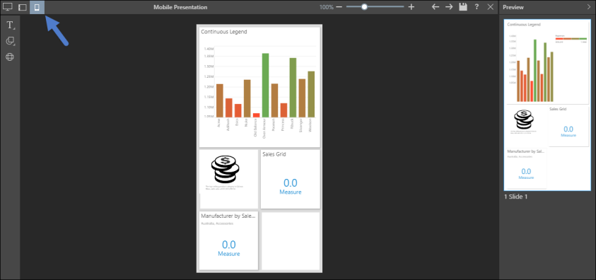
Presentations for mobile phones must be built from the desktop or tablet application; they cannot be built from the mobile phone app. Optimize presentations for mobile phone by building them in mobile device mode. Choose this option from the New Presentation window, or by clicking the mobile icon above the presentation canvas (blue arrow below).
Place visuals on the tiles and resize as required. Some content will appear as a miniature visualization (see below for details).

Optimize for Multiple Devices
You can easily optimize a single presentation for multiple device types. To do this, simply convert the presentation to the required device type, and place content in each presentation view as needed. For instance, you may want to optimize a presentation for desktop, tablet, and mobile. In this case, start by building your presentation in desktop mode, then convert from desktop to tablet. The desktop presentation content will be propagated to the tablet presentation.
Next, convert the presentation to mobile. It can be converted from either desktop or tablet; convert from whichever format contains the content that should be copied to mobile format. Any data visualizations copied to mobile format will appear in the mobile view. Other assets like buttons, text, and images will not appear in the mobile view; they must be added manually as needed.
Once the presentation type has been converted, any changes made in one format will not affect the other formats.
Save the presentation as usual.
Dynamic Assets
Only a presentation built in mobile device mode will display text, buttons, and dynamic assets (dynamic images, dynamic text, dynamic URLs, and dynamic jump buttons), when viewed on a phone.
If the presentation was not built in mobile device mode, only data visualizations will appear when the presentation is viewed on a phone. For this reason, it's very important to optimize presentations for mobile by building them in mobile device mode.
Miniature Visualizations
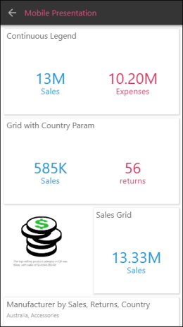
When viewing presentations on your phone, grids are displayed as miniature visualizations by default. This is a number tile, which you can click on to open the grid.
When building a presentation in mobile device mode, all visualizations are displayed in this way by default. When the presentation is viewed on a phone, the values are loaded at runtime. The visualization can be viewed by clicking the number tile.
To show the visualization rather than the number tile, resize the visual so that it is larger than two tiles.
Note: grids can only be displayed as miniature visualizations.
